


The quick access palette menu
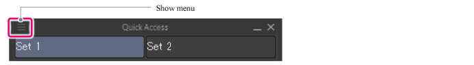
The following describes the functions included in the menu that will be displayed when [Show Menu] on the upper left corner of the [Information] palette is clicked.
Create set
New access sets can be created.
For how to create an auto action set, refer to "Add a quick access set".
Manage set
The selected quick access set's name can be changed.

Delete set
The selected quick access plate can be deleted.
Switching sets
If selected, the quick access set's name will be displayed.
When a quick access set's name is selected, the selected quick access set will be displayed in the [Quick Access] palette.
Display set list
Displays/hides the setlist.
|
|
When the set list is hidden, the displayed quick access set can be changed by selecting [Quick Access] > [Show Menu] > [Switch the set]. |
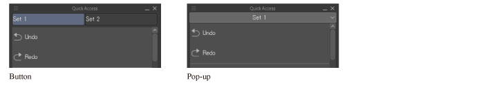
How to display set lists
Set list display methods can be set as well. [Button] and [Pop-up] can be selected.
View
Display methods of the buttons in the button list can be changed.
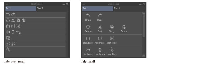
Tile(very small, small, medium, large)
When [Tile] is selected, buttons will be displayed as tiles. Four button sizes are available.
When [Tile(very small)] is selected, button names will not be displayed.
Button size will be fixed regardless of the [Quick Access] palette's width.
Tile(4 step, 8 steps, 16 steps)
Similar to [Tile (very small, small, medium, large)], buttons can be displayed as tiles.
The ‘step' is the maximum amount of buttons allowed in one column. [4 step], [8 step], and [12 step] can be selected.
Button size will change along with the [Quick Access] palette's width.
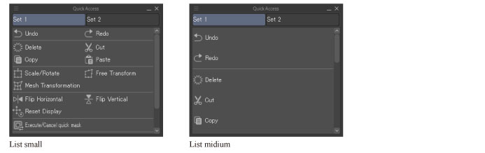
List(small, medium, large)
When [List] is selected, buttons will be displayed as a list. Three button sizes are available.
When the [Quick Access] palette's width is changed, the number of buttons in a column will change.
List(1 step, 2 steps, 3 steps)
Similar to [List (Small, Medium, Large)], buttons can be displayed as a list.
The ‘step' is the maximum amount of buttons allowed in one column. [1 step], [2 step], and [3 step] can be selected.
The number of buttons in a row will be fixed, regardless of the [Quick Access] palette's width.
Change Order
The [Quick Access] palette's button order method can be selected.
|
Drag |
Orders can be changed by dragging a button. |
|
Ctrl + drag |
The order can be arranged by dragging a button while holding down Ctrl. |
Quick access settings
The [Quick Access Settings] dialog will be displayed, allowing editing of the button list's buttons.
For how to edit button lists, refer to "Button list operation".
For details on the [Quick Access Settings] dialog, see "Quick access settings dialog".
Restore default layout [Windows/macOS/Tablet]
Revert the [Quick Access] palette layout to its initial state.
When reverted to its initial state, added quick access sets and buttons will be deleted, and their position will be reverted.
|
|
·Even when settings are reset, display methods set in [How to display set lists] and [View] will be maintained. ·Images and background colors set as button icons will be maintained after deletion. |
Hide the quick access palette
Hides the [Quick Access] palette.
|
|
To show the quick access palette again, select [Quick Access] from the [Window] menu. If you are using a Smartphone, tap the icon on the palette bar. |
Button list Menu
It is the menu that is displayed when right-clicking on the button list.
|
|
·Depending on the type and position of the right-clicked button, the items displayed in the menu may differ. ·If you are using a Smartphone, you can also display the button list menu by long pressing above the preview in the [Quick Access Settings] dialog box. |
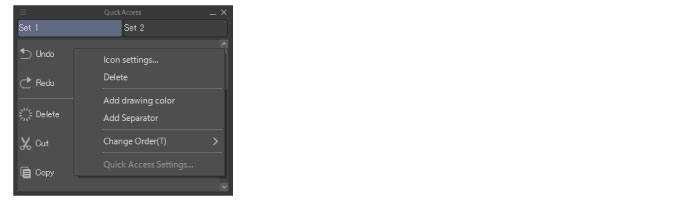
Icon settings
The [Icon settings] dialog box will be shown, allowing the setting of names, display methods, etc. of icons.
For the [Icon settings] dialog, see "Icon settings dialog".
|
|
·When the menu is displayed over drawing colors, sub tools, etc. this will not be displayed. ·Icons set with the [Icon settings] dialog will reflect those contents set here, even when the same icon is added to the [Command bar] or [Selection launcher]. |
Sub Tool Settings
The [Settings of sub tool] dialog will be displayed, allowing the setting of the name, display method, etc. of the sub tool. It is displayed when the sub tool button is right clicked.
For details on the [Settings of sub tool] dialog, see "Sub tool settings dialog".
|
|
The contents set in the [Settings of sub tool] dialog will be reflected in the [Tool] palette and [Sub Tool] palette, among others. For example, when a sub tool's name is changed, the same name will be applied to the sub tool in the [Sub Tool] palette. |
Name Settings
The [Name Settings] dialog will be displayed, and the color's name can be changed.
The name set here will only be reflected in the [Quick Access] palette.
Deleted
The right clicked button can be deleted.
Add drawing color
The drawing color currently selected in the color palette etc. will be added to the button list.
Add Separator
A separator will be added under the button that was right clicked when displaying the menu. Following buttons will be added under the separator.
Change Order
The [Quick Access] palette's button order method can be selected.
|
Drag |
Orders can be changed by dragging a button. |
|
Ctrl + drag |
The order can be arranged by dragging a button while holding down Ctrl. |
|
|
By changing [Change Order] to [Ctrl + Drag] in the Quick access palette, the following actions can be performed with a pen stylus. ·Scroll through the palette by swiping with a pen, when in an environment that supports touch operations. ·When using a Tablet, you can perform the same operation as a right click by long pressing with a pen. |
Quick access settings
The [Quick Access Settings] dialog will be displayed, allowing editing of the button list's buttons.
For how to edit button lists, refer to "Button list operation".
For details on the [Quick Access Settings] dialog, see "Quick access settings dialog".
Delete Separator
The right clicked separator can be deleted.
Unlike other menus, it is displayed when a separator is right clicked. Furthermore, when this item is displayed, other items will not be displayed in the menu.